There are a handful of fields that I want in the same place at the top of every record for consistency. I’ll call this the record “header.”
In the Left column I prefer:
- Record Owner
- Link to Parent (e.g. Account “Parent Account” or Contact “Reports To”)
- Record Name
- Picklists that help categorize the record (e.g. Account or Opportunity “Type” field)
On the Right column I prefer:
- Any type of Stage or Status
- Any visual clues I’ve created to communicate action needed (neglected account, case aging, missing information, etc)
- Items that need to be maintained frequently (e.g. Close Date and Amount on Opportunities)
Here is an example Opportunity page layout with this layout concept in mind:
After that fields with higher value (i.e. data that is updated more frequently) should be higher up on the page as we don’t want Users to have to scroll unnecessarily. Additionally be cognizant to the order in which you are requiring users to enter information.
Balance all the above by grouping “like” fields together and using sections to organize the page. For example, maybe education history is important on your Contacts. Create a section on the page to keep this information separated from the address, and other contact information.
System stamps
I’m a big fan of seeing created, modified and other system stamps at the bottom of all records.
Page Layouts on Activities
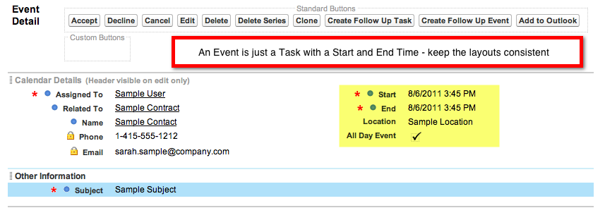
I’m a stickler on having the Page Layout on Tasks and Events similar to reduce the learning curve with Users. If you think about it, an Event is just a Task with a start and stop time – right? Remember consistency helps drive adoption!
Sample Task Page Layout:
Sample Event Page Layout:
Assignment Checkbox
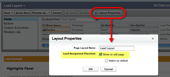
Ever notice this little checkbox on the bottom of the edit screen for Leads and Cases?
Do you use it? If not, you may want to pull it off the page layout as your Users are going to ask you about it ;). You can do so from the Leads or Case page layout by clicking “Layout Properties” in the header of the page layout editor.
Use checkboxes instead of a “Yes / No” picklist
If you have a picklist with the values of “Yes” and “No,” consider using a checkbox field instead. If the checkbox is unchecked then the value is “no” – get it? Checkboxes are faster for users to select versus a picklist, which increases data entry!
Using Help Text on Fields
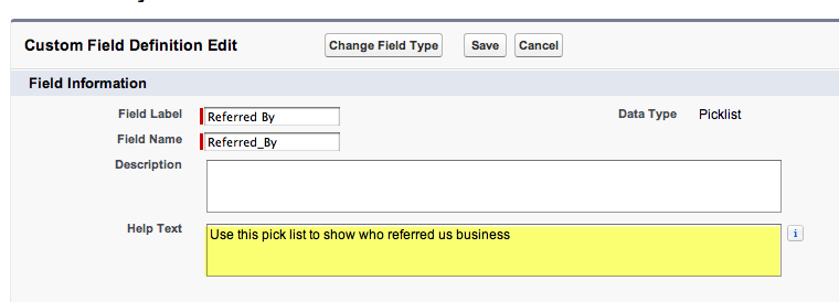
I think adding help text to fields is useful not only to Users, but Administrators as well (we have short term memory). Just a snippet of information as to the purpose of the field can go a long way. You can even add help text to a formula fields to explain a calculation that is occurring on a record (e.g. a commission calculation on an Opportunity).
“Invisible” Page Breaks
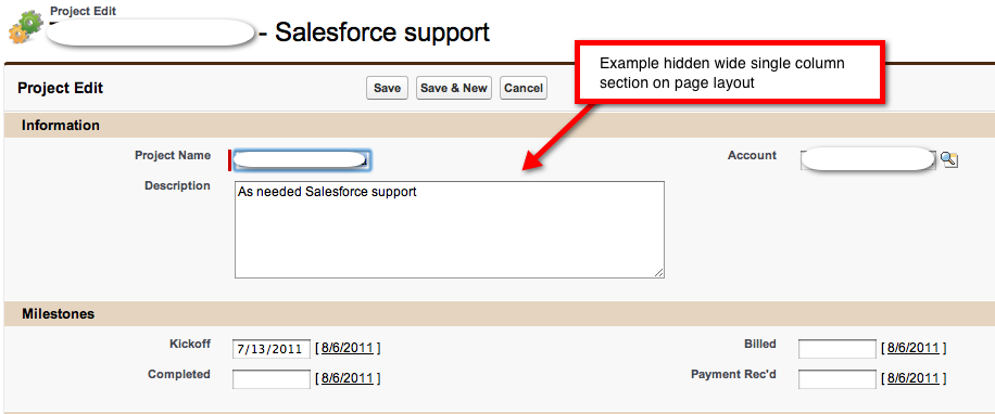
There are a handful of field data types that in my opinion deserve to be displayed in a single column layout:
- Multi-Select picklists
- Text Area (255 characters – e.g. the native Subject field)
- Long Text Area (e.g. the native Description field)
- URL (possibly – depends if it is just a website URL or something nasty long like a search query)
So what if the majority of the page is two-column but you want to include one of the fields above? I like to create an “Invisible” section break – invisible because I do not show the section on either the Detail or Edit page.
Give Multi-Select Picklists the space they deserve!
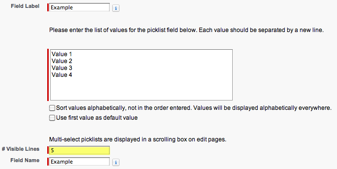
If you have a multi-select picklist with a handful of values, say six or less, you can eliminate the scrolling for users by simply increasing the number of visible lines for the field. Also if you have a huge amount of values in your multi-select picklist, you might also considering the number of visible lines to allow users to see more information at one time.
In our example below we have four picklist values, so to eliminate the need for a scroll bar, we increase the number of visible lines to five.
Required Fields
I’m a big fan of having as few required fields as possible to create a record. I understand that a Lead record has little value if it doesn’t have a phone and email address – how else are you going to make contact? That being said, what if you only have one of the two pieces of information – wouldn’t you still want to capture that Lead? If you make both fields required you will inevitably get a lot of bogus data from the Users (e.g. email addresses that look like email@email.com and phone numbers that start with “555”).
A better solution might be to use a Validation Rule that requires at least one of the fields to be filled in before the Lead record can be saved.
Reduce Page Noise
Any of the “out of the box” fields that come with Salesforce that are not utilized by your company (i.e. No. of Employees or Annual Revenue on Leads) pull off the page. If you keep them there Users will feel obligated to enter something and slow down data entry.
As aforementioned, we want to remove all fields that have no value to the User. However there may be some fields that Salesforce requires to be on the Page Layout but may not support your business processes (e.g. Case “Priority”, Opportunity “Probability %”, etc). In those cases my suggestion is to bury the fields as low on the page as possible.
Image Fields
If you are not leaving visual clues for your Users that a records needs attention – you’re missing out!
Some of my favorites and most frequently used are the flag and stoplight icons:
How do you create those? Actually they are formula fields that you put on the page layout (and show up on Reports and Views as well). Salesforce use to provide a separate guide with examples, but now you can find image examples in help. I also created a blog post with some real-world examples of image formula fields. Salesforce recently went a little nuts and added a whole slew of new icons. They are available here on AppExchange. I’ve also provided some real world examples of Image Formula Fields.
Think you are finished? Not even close. Stay tuned for one more post on great Salesforce Usability tips where we will cover:
Search
- How to get the most out of search
- Search result filters
- Chatter & Global Search
- Controlling what is searchable – record names, External IDs, phone numbers, email addresses
Additional Usability Tweaks
- Add Lookup Filters
- Report Links – pull out links you don’t use (reduce the noise)
- Provide Custom Views to allow Users to filter records quickly
Related Lists
- Remove related lists not used by your organization off the page layout
- Add additional columns on related lists to reduce need to “click through” to determine if you have the right record
- Controlling the sort order of related list records
Report & Dashboard Folders
- Organize Dashboard reports in a separate folder so they can be protected from accidental deletion
- Use consistent naming conventions (e.g. “DB” & “LINK”)
Previous blog posts on Usability:


