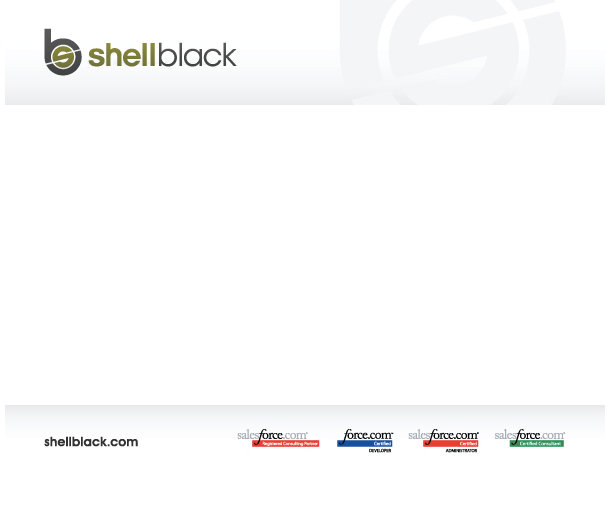
As I’ve posted before, branded HTML emails are a great way to push your brand AND have the extra benefit of tracking in Salesforce whether your email was received and opened. So let’s look at the first step at creating an HTML email – the letterhead. What is a letterhead in Salesforce? Think of old school business stationary with your company logo that you used to put in a typewriter for sending out business communications – you do remember those days, right? A letterhead is conceptually the same. It’s a template that you can use to incorporate your brand when sending emails from Salesforce.
Before you go barreling into creating a Letterhead, you first need to have your logo (or whatever graphic you’d like to use) in your Documents folder ready to go. I’ve found that if you want a logo to span the entire width of the email, that you want your graphic to be no wider than 600 pixels. The height is not as much of an issue, use your esthetic judgment, but 200 pixels or less would probably be ideal. Stick to the most common formats – .jpg, .gif or .png. To load our graphics into the Documents folder we are going to go to the Documents Tab, create a new folder called “Logos,” then upload our images.
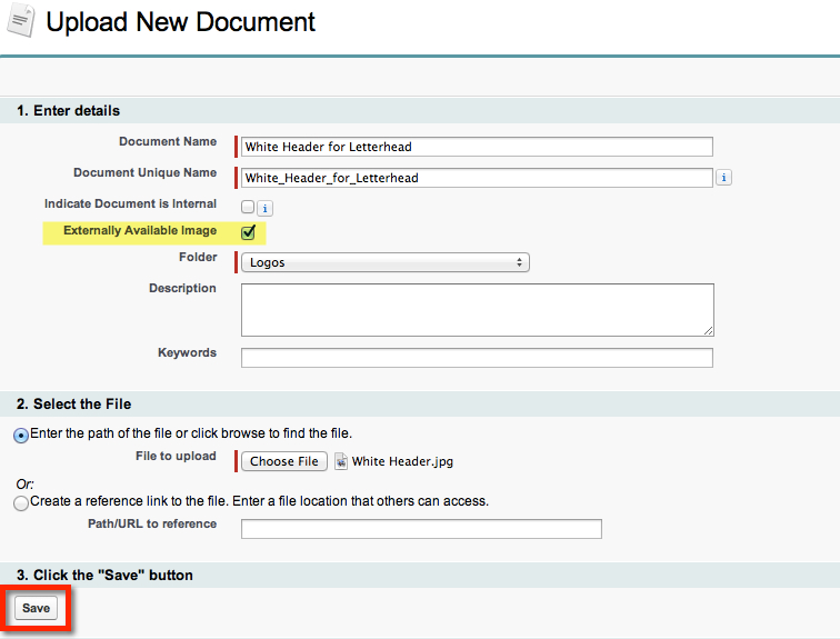
Be sure when you are creating your document to click the “Externally Available Image” – if you don’t, the graphic won’t render when you send an email! For this example I’m going to upload both a header and footer image.
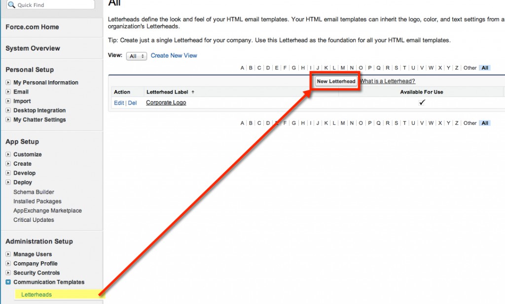
Now that we have our images uploaded, we can now create the letterhead. Go to Setup > Administration Setup > Letterheads, then click the “New Letterhead” button.
On the next screen you’ll see the Letterhead Properties screen. Give the Letterhead a name and description. Be sure to click the “Available for Use” checkbox – if you don’t, you can’t create an HTML email that uses that Letterhead.
Ok, the next screen is a bit ugly for your “out of the box” letterhead. So let’s look at what can be changed. As illustrated in the screenshot below, you can change the colors for the Background and Body (where you type), the height and colors of the three dividing lines, and in the Header and Footer sections at the top and bottom of the letterhead you can change the Logo alignment (e.g. top left justified), background color and height of the logo box.
I’m going to go for a rather a stark clean look since my header and footer graphics are already created to leverage white. We’re going to make the dividing lines disappear as well. First let’s change the background color by clicking the “Edit Background Color” button at the top left of the letterhead.
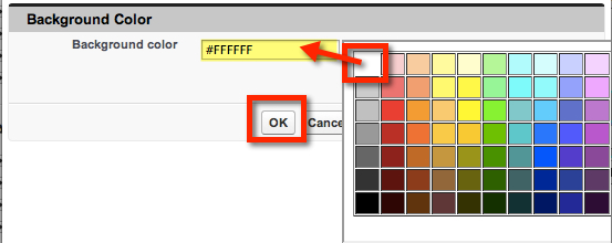
You’ll see that the colors are displayed in Hexadecimal. Luckily there is a little pallet Icon we can click to choose a standard color.
When we choose white from out pallet, you’ll see the hexadecimal color change to #FFFFFF. You might want to copy #FFFFFF to the clipboard, where going to use it three more times. When done, click “OK.”
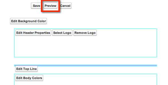
You’ll notice our Letterhead is starting to change. If you click the “Preview” button at the top of the page you can see how our letterhead is coming along.
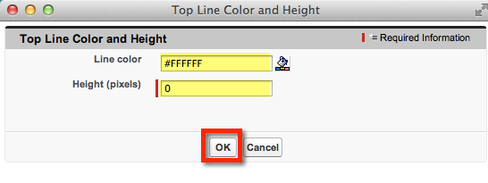
Well we still have three odd colored dividing lines we need to address, so let’s do that now. Click the “Edit Top Line” button.
I want to mask (or hide) these lines altogether. To do that I’ll have the lines match my background color – #FFFFF and change the height to “0”. Repeat this step for the Middle and Bottom lines as well.
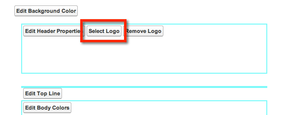
If you click the preview button at this point you should see, well, nothing because we’ve made a completely white canvas. Now let’s add our Header and Footer Image. Click “Select Logo.”
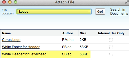
From Documents, make sure you’re on the Logo folder we created earlier and pick your logo.
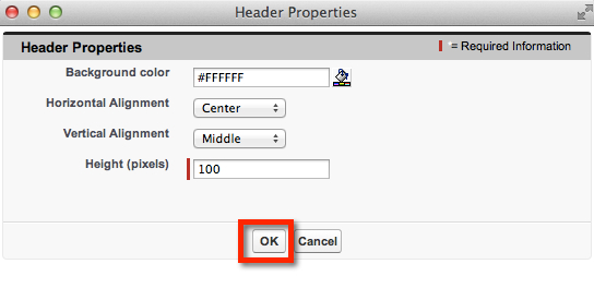
Before we leave this step, let’s take a look at what options are available under “Edit Header Properties.”
You’ll see that you can edit the background color as well as adjust the alignment of your logo (e.g. top left, or centered horizontally and vertically). You can also adjust the height of your Header box. If your logo is taller than 100 pixels, the box will automatically adjust. If you’re logo is less than 100 pixels, consider adjusting this down to the height of your graphic so you don’t have a large gap between your logo and the text on your HTML email.
We’ll do the same steps for the footer and select our footer image.
If we click the preview button at the top of the screen we should see something like the screenshot below – the body of the letterhead framed by the Header and Footer.
That’s it – click Save!
Next we’ll look at creating an HTML email with merge fields that leverages our new Letterhead.

