In our previous post we discussed why Usability is important. In this installment let’s get started configuring Salesforce with Usability in mind. First stop – the Home Tab!
Salesforce out-of-the-box likes to put a lot of noise on the Home Tab. Again, my preference but I like to turn a couple of things off.
Remove the Dashboard Snapshot
Blasphemy?! I like the right (or wide-pane) of the Home Tab page layout to contain only Tasks and Events. If you include the Dashboard Snapshot, for a lot of Users, you now have to scroll top and bottom. If you prioritize what has the most value, I’d argue for managing your day in Salesforce – and the Dashboard Snapshot loses when space is at a premium. If you want to see your business metrics – click the dashboard tab! This will eliminate a lot of support calls to Administrators as well (e.g. “Why does my neighbor see a different dashboard on the Home Tab?).
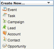
Remove Quick Create
My biggest complaint with Quick Create is that it allows users to form bad habits. For example you should always create an Account before creating the Contact record. The benefit of this is twofold. First you reduce the risk of having an “orphaned” Contact (a Contact without an associated Account), and secondly, information from the Account (such as the phone, fax number and address information) will automatically cascade to the Contact when you create the Contact from the Account record. All of this equates to reduced data entry on your Users!
Recent Items
If you have removed this from the Home Page you have done your Users a big disservice. Recent Items exist to prevent Users from using Search to find records – you are saving them valuable clicks! Because Recent Items is so useful, it should be high on the Home Page Layout in the narrow (left) pane.
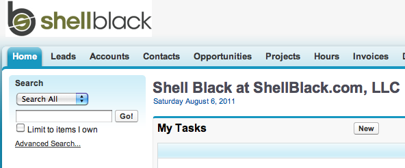
Branding
Not really Usability, but why not add your company logo? You’ve paid for it – why not own it! Might drive some adoption 😉
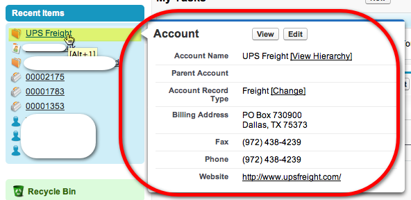
Hover Detail
This is a great Usability feature if you make the effort to configure it. For each object you will need to update the “Mini Page Layout” to control what fields display when you hover over a record. The benefit to the User is they can inspect a record for key information without clicking through to the record (especially handy with Cases when the record name is just a number).
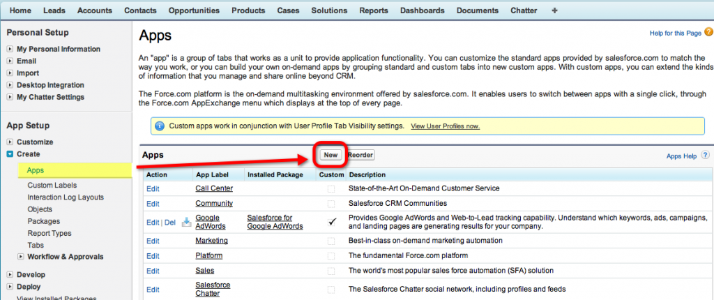
Organizing Tabs into “Apps” – It’s real easy to have tabs flowing all the way across the top of the screen, especially if you are an administrator. If your org has gone a little Custom Object crazy (or you’ve downloaded a lot of apps off the AppExchange), do yourself a favor and start organizing your tabs into “Applications.” Applications are really just a subset of Tabs which are accessed from the top left of the page. You create an App from Setup > App Setup > Create > Apps.
Lets say we want to create an Application for our Back Office group. These Users only need to see the Home Tab, Accounts, Contacts and Opportunities as well as a few Reports! With just a few clicks you can reduce the noise on the page:
Custom Links
I’m going to declare this as optional- Consider adding custom links to the left column (narrow pane) – above the Recycle Bin but below Recent Items The Home Tab to keep Users inside of Salesforce and using the tool like a portal.
Next up – customizing fields and page layouts for great usability!


