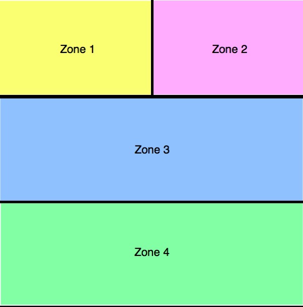
This “Zone Approach” to page layout design that I’m outlining below is really to accomplish one thing – consistency. The more consistent you are as a System Administrator with field placement decisions, the easier you’re making it for your users to navigate and do their job.
Think for a minute about a website you’ve visited that allows you to get in, find what you want, do what you need quickly, and then you’re off to the next task of the day. Shouldn’t Salesforce be that type of experience? To reach this browser based nirvana you need to be consistent with your page design. If tab-by-tab users have to stop, search, scroll, or click to figure something out you’re inflicting pain and frustration on your users – which ultimately hurts adoption. If you make creating and updating records difficult, users will find another way to get their job done (e.g. go back to email, paper, and spreadsheets).
Please don’t let Salesforce become a glorified Rolodex – when this happens a kitten dies in the cloud.
OK System Administrators, what’s our game plan to be sure we’re consistent and driving user adoption? Get into the Zone! Below I’ve outlined four zones for your page layout and what type of information deserves to be in which zone. I’ve also given specific field examples by some of the major Tabs in Salesforce to drive it home.
Zone 1 – (Top Left) Record Owner, Record Name, Lookups, fields that categorize
It’s key to put lookup fields in Zone 1. It’s the users path to navigate to parent or related records. Said differently, lookup fields are the “back button” so users don’t feel the need to use other navigation (either the browser’s back button or Recent Items).
I like using a couple of picklist fields in Zone 1 to categorize the record. It quickly tells a user what type of record their dealing with the first time they see the page. For example, this Opportunity is for existing business, this Contact works in accounting, this Account is in manufacturing, this Case came in from the website.
Fields I expect to see in Zone 1:
- Leads – Record Owner, Name, Company, Title
- Accounts – Record Owner, Account Name, Parent Account, Type, Industry
- Contacts – Record Owner, Account Name, Contact Name, Title, Reports To, Department
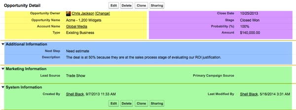
- Opportunities – Record Owner, Opportunity Name, Account Name, Type
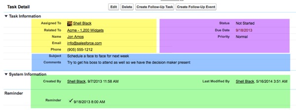
- Activities – Assigned To, Related To, Name
See the consistent thread? Record Owner, Record Name and Lookup fields are always in Zone 1. No matter what record I navigate to Salesforce, as a user I know what to expect in this zone.
Opportunity layout in zones:
Zone 2 – (Top Right) Fields that are maintained frequently / fields used to reach a person or company
Once a record has been created, this is the zone that needs to be maintained frequently (think Lead Status, Opportunity Stage / Close Date / Amount, Case Status, Activity Status), or contains field that allow you to reach that person or company (think Phone, Email, Website, etc).
Fields I expect to see in Zone 2:
- Leads – Lead Status, Rating, Phone, Mobile, Email, Fax
- Accounts – Phone, Fax, Website
- Contact – Phone, Mobile, Fax, Email, custom “reach me” fields
- Opportunities – Stage, Amount, Probability, Close Date
- Activities – Status, Due Date, Priority
Zone 3 – (Middle) High value information. but updated less frequently
In this zone we can put custom fields that are important to your organization, or other high value “out of the box” fields (e.g. Address fields). These are fields you should be able to see without scrolling down (“above the fold” as they say in website design). For most companies I think the Description field makes the cut rather than relegated to Zone 4 because it’s informative and it gets used quite a bit.
Fields that I expect to see in Zone 3:
- Leads – Address, Industry, Annual Revenue, Number of Employees, high value custom fields
- Accounts – Billing Address, Shipping Address, Description, Industry, Annual Revenue, high value custom fields
- Contacts – Mailing Address, Other Address, Description, high value custom fields
- Activities – Subject, Comments
If you have trouble deciding what fields should go in Zone 3 versus 4, think about scrolling. Fields that users update frequently should be high up on the page layout (so you don’t have to scroll). Fields that get updated once, or perhaps never, get relegated below to Zone 4.
Account layout in zones:
Zone 4 – (Bottom) Fields you update once or occasionally, and system fields
These are fields that your Users might have to scroll down to see, but since they are not used often, they won’t be drudgery to update. This is a good spot for any “out of the box” fields that you set once and never updated thereafter (e.g. marketing fields like Lead Source, Primary Campaign, Email Opt Out), custom fields that are sporadically used, and system generated fields (e.g. Created By, Last Modified By).
Yes, I’m old school. I think system fields are valuable and therefore like to see them included on page layouts. When I need to know who created or updated a record, I don’t mind scrolling down for a quick visual verification.
Fields I expect to see in Zone 4:
- Leads – marketing fields that you set once (e.g. Lead Source, Email Opt Out), or other custom fields that are only used occasionally, system fields
- Accounts – custom fields that are only used occasionally, system fields
- Contacts – marketing fields that you set once (e.g. Lead Source, Email Opt Out), other custom fields that are only used occasionally, system fields
- Opportunities – marketing fields that you set once (e.g. Lead Source, Primary Campaign), other custom fields that are only used occasionally, system fields
- Activities – system fields
Task layout in zones:
Balance the above with logic and esthetics
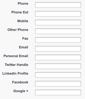
Some fields might make the cut to be in another zone if you want to group similar fields together. For example, on the Contact page I like keeping a block of social media fields underneath the “out of the box” phone and email fields. Thought social media fields are not frequently maintained and probably rarely populated, all the methods for me to reach someone are in one place – and that resonates with me as logical.
Aesthetics also comes into play when laying out your page layouts. You might want to keep a clustering of date, checkboxes, or picklist fields together in Zone 3 or Zone 4. Users like clustering – so it’s not bad from a usability perspective: “Where is that date field? Oh, in this section with the other date fields!” You might create an additional section on the page layout to keep things organized and tidy. How high on the page this custom section resides still follows the zone concept that more frequently updated fields should be closer to the top. For example on Leads you might have a section of qualifying or knock out questions that are composed of a set of picklist fields. By keeping like fields together, users are less likely to miss one of the questions.
Example of clustering – all my “Roll-up” calculations in one place making it easy for a user to find and understand:
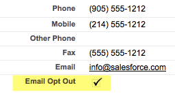
It might make you mental that the Email Opt Out field isn’t nested below the native Email field. Email Opt Out is a “set it and forget it” field, so I chose to put it in Zone 4 (I’m mean really – after opting out, who ever opts back in?), but to you it might just seem natural to keep this field nested under the native Email field.
If you are unsure where to put a field, go ask your users! You’re designing these pages for them, not for you!
Final Point
All of the above are simply guidelines. You might have a different take on where something should go. For your company Lead Source might be a huge driver in what you do with a Lead, so based on that it might need to be in Zone 1. The goal of thinking about your pages in Zones is to be consistent page to page. Done well, when a user hits a new tab or jumps to a new object they’ve never seen before, they shouldn’t have to think how to navigate back to related records or know what’s important for them to fill in and maintain.
As a System Administrator, once you start down this design path it becomes natural. You’ll never put a lookup field or a high use picklist field at the bottom of a page again!
Other good reads on designing Salesforce for usability and adoption:
- Slideshare presentation on configuring Salesforce for usability
- Usability Secrets of a Salesforce Consultant (covers usability tips for setting up the Home Tab and a bunch of valuable nuggets for a better user experience)
- Using formula fields to give users a visual representation of a status or rating (Flags, Stars, Stoplight Icons, etc)
